Design and Files
T-shirt inscription: how to select font and text layout
How do I design a clear inscription on my shirt? Choose the type of writing, contrast, row division and size of letters to the content and print site.
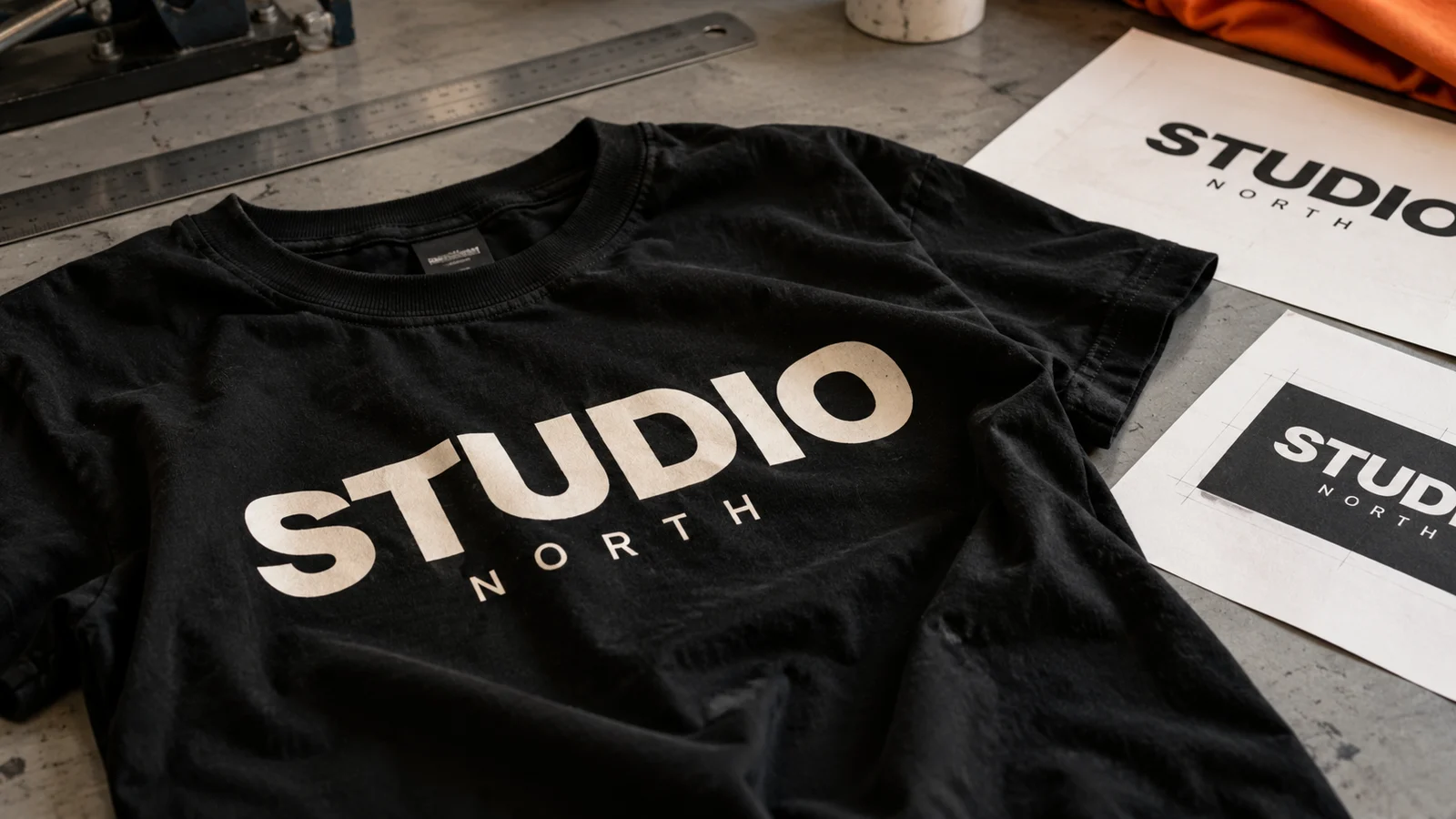
The inscription on the T-shirt works like a short message seen in motion. Its readability is determined not only by the font, but also by the length of the text, spacing and place on the clothes. It is worth to start with a sentence that is to be remembered and then choose decorations.
Find out what the recipient is to read first
If the project contains a password, date and signature, do not broadcast all items of the same size. The main sentence should dominate. The date or name of the event may create a second, calmer level. A small dedication is a close-up reading information, so it should not compete with the password.
Example: In the project "Together since 1998" the word "Together" can be the largest and the year is a separate accent. In a souvenir T-shirt with a longer quote will be more important equal, convenient to read column. One deal doesn't work in both situations.
The character of the letters should match the content
A simple sheriffless cut helps with short, expressive messages. Letters with sheriffs can give the project a calm, editorial character. Handwriting builds a more personal tone, but too thin connections and decorative wrappers can make marking difficult.
One cut in two thicknesses or a pair of distinctly different cuts is enough to begin with. Combining several decorative fonts usually weakens the hierarchy. Check Polish characters: "Ł," "a" or "a" should look like a part of the same alphabet, not a random substitute.
Don't stretch the letters horizontally just to fill the width. It is better to choose the appropriate version of the cut, change the writing rank or layout of the lines. Also check the font license for the intended application.
Breakdown of rows is part of the project
Read the text aloud and share it according to sense. Accidentally left alone a word can look like a mistake. With Polish texts, it is worth to watch for short coherents and prepositions, especially when the project has several widths for different sizes of clothing.
- Check the short inscription in one line as well as in two.
- With a longer sentence, select one main accent instead of adding every word.
- In the arc arrangement, evaluate the spacing between the letters at the ends of the inscription.
- Do not add text to the seam, pocket or edge of the hood without checking a particular model.
Contrast and technique affect readability
A delicate gray inscription on a black shirt may give a discreet effect, but it will not be as visible as white. If you want to read the password from a few steps, first take care of the contrast and then make it decorative. You can read about background selection rules in the guide graphic color and t-shirt color.
With embroidery, small interiors of letters and thin connections require a separate evaluation. A design that is legible as a printing does not have to work as an embroidery in the same size. Flex should be considered with simple writing, and DTF with compositions containing colours and illustrations. The technique is selected for the actual file, clothing and order quantity.
Check the string in real size
Print the project on paper in the planned dimension and put it on your clothes. Walk away a few steps, then check the small pieces up close. Also evaluate the proportions on the smallest size ordered. A view on a large monitor often makes the text seem clearer than on clothing.
To be completed, also send the text in a regular message. This allows you to compare spelling, dates and diacritics with the design. In the production file, it is worth saving the version with the text converted into curves and a separate editable copy for subsequent changes.
THE MOST COMMON QUESTIONS
FAQ
Should all the letters be big?
No. Versailles work well in short passwords, but a longer sentence can be more convenient to read with a simple record. The choice depends on the nature of the project.
How big should it be?
There is no one dimension for each cut and marking site. Rate the design on a real scale, on a specific clothing, taking into account the thickness of the lines and the distance of reading.
Can a handwritten signature also be used?
Yes, after assessing the quality and thickness of the line. Authentic writing requires a different approach than the ready font; it is worth saving the original and reducing smoothing.
YOUR PROJECT
Show us the sign you want to wear.
CZYTAJ DALEJ